BOV ATM Guides 2026
Rebranding Step by Step ATM Guides for their clients
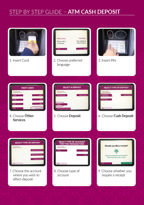
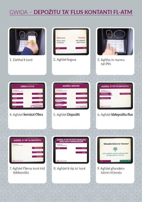
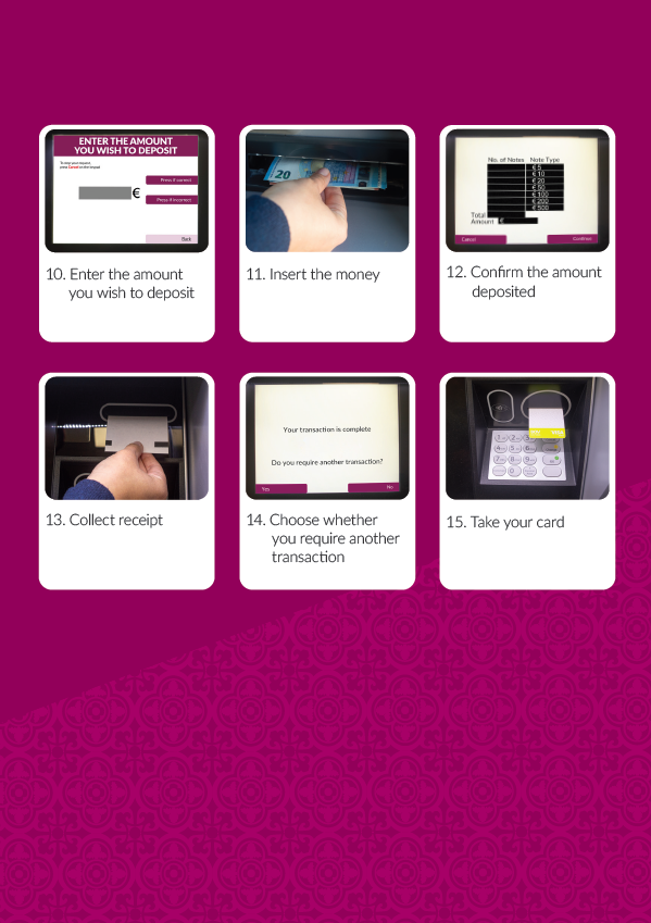
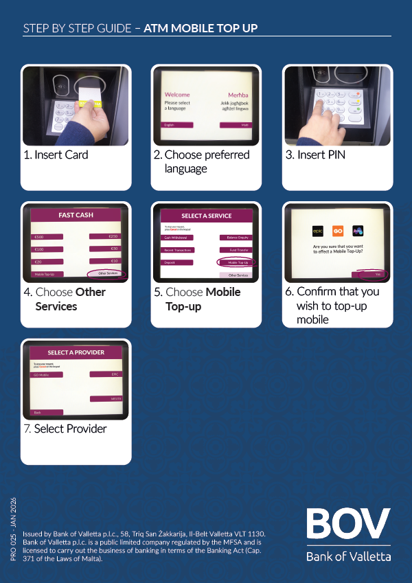
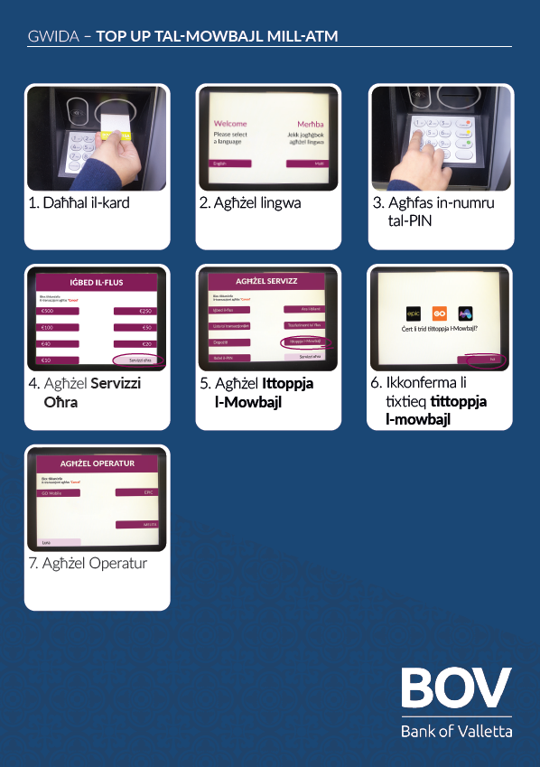
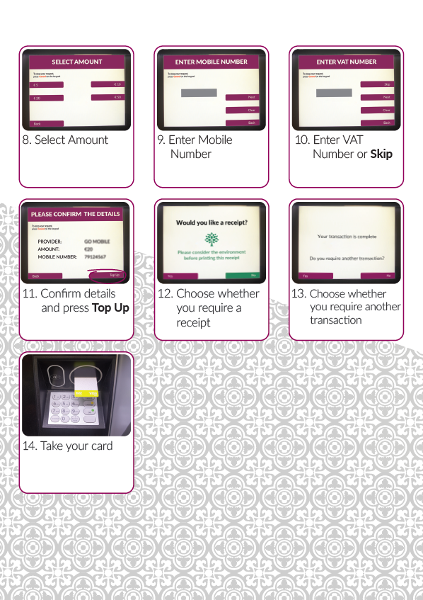
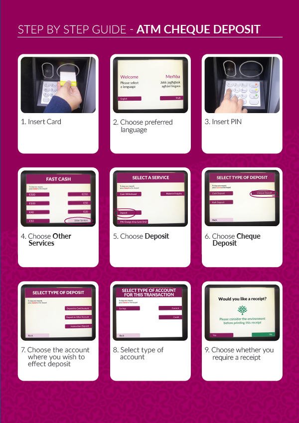
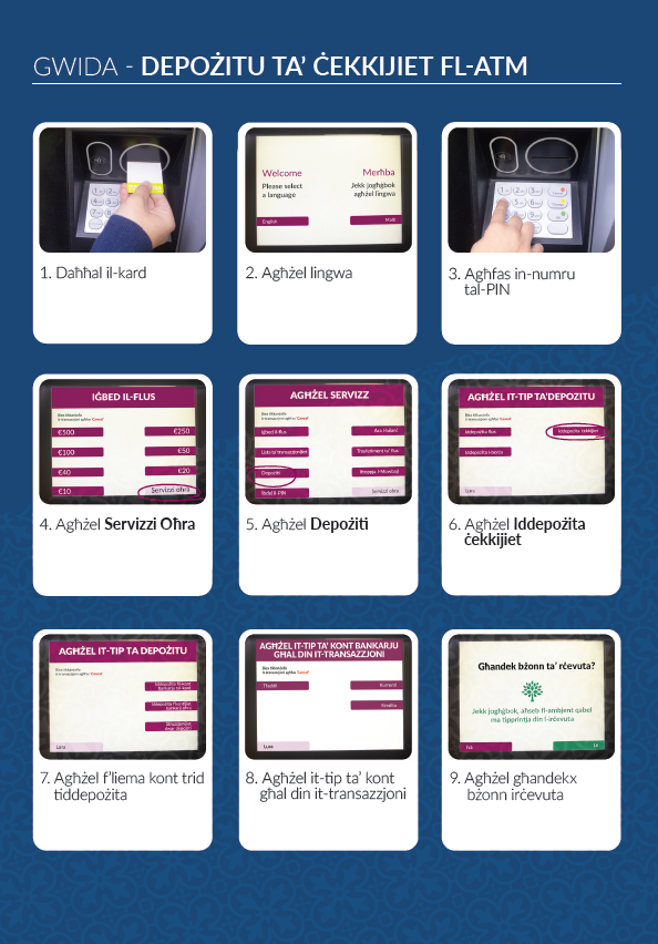
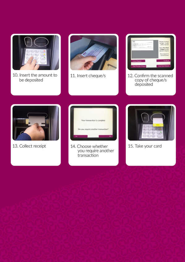
This project involved the redesign and creation of six instructional ATM
brochures for Bank of Valletta, covering step-by-step processes such as cash deposits,
cheque
deposits, credit card deposits, and other ATM services. The main objective was to transform the
bank’s existing brochures into a clearer, more user-friendly experience while maintaining a
professional and corporate visual identity. The focus was not only on presenting information
accurately, but also on improving readability, simplifying navigation, and ensuring that
customers could easily follow each process without confusion.
To maintain strong brand consistency throughout the series, I incorporated the official brand
colours alongside graphic patterns inspired by the artwork featured on BOV’s banking cards.
This
allowed the brochures to feel visually connected to the wider BOV identity while giving the
materials a refreshed and more modern appearance. Careful attention was given to layout
structure, icon placement, typography hierarchy, and pacing of information to create a clean and
approachable design system across all six brochures.
The project strengthened my understanding
of corporate communication design and demonstrated how functional information can still be
visually engaging while remaining accessible and easy to understand.